Button
The Button Component is a convenient shortcut for creating User Interface buttons for use with Screen and Element Components. It responds to input on the element of its own entity, which should have Use Input enabled.
The Button Component can be used in two Transition Modes. Sprite Change, which uses a different sprite or frame for each button state or Tint, which tints a single sprite with a different color for each state.
Common Properties
| Property | Description |
|---|---|
| Active | When enabled the button will respond to and fire events. When disabled the button is set to the Inactive State. |
| Image | The entity whose image element changes color or sprite as the button changes state. The User Interface › Button menu sets it to the button's own entity. With no entity, the button doesn't change. |
| Hit Padding | Additional space around the button's own element that will be included when testing for input events. Specified as left, bottom, right, top padding values. |
| Transition Mode | The type of effect to use when transitioning between states. Either Sprite Change or Tint. |
Sprite Change Properties
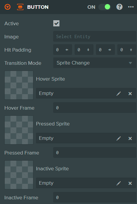
| Property | Description |
|---|---|
| Hover Sprite | The Sprite Asset used when the button is in the Hover State. |
| Hover Frame | The Sprite Frame to display when the button is in the Hover State. |
| Pressed Sprite | The Sprite Asset used when the button is in the Pressed State. |
| Pressed Frame | The Sprite Frame to display when the button is in the Pressed State. |
| Inactive Sprite | The Sprite Asset used when the button is not active. |
| Inactive Frame | The Sprite Frame used when the button is not active. |
Tint Properties
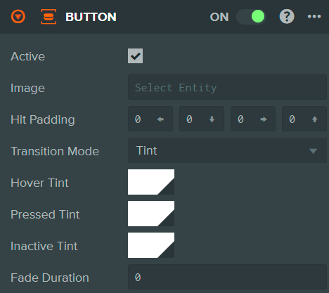
| Property | Description |
|---|---|
| Hover Tint | The color to tint the Image Element with when the button is in the Hover State. |
| Pressed Tint | The color to tint the Image Element with when the button is in the Pressed State. |
| Inactive Tint | The color to tint the Image Element with when the button is in the Inactive State. |
| Fade Duration | The time in milliseconds to blend between the different state colors. |
See Also
- Element Component - Required for button visuals
- Screen Component - The root component for user interfaces
- Buttons - Creating buttons, their transitions, events and hit padding
- User Interface - Learn more about building user interfaces
Scripting Interface
You can control a Button Component's properties using a Script Component. The Button Component's scripting interface is here.